Project Overview e360Digital was entrusted with the creation of a seamless logo design for 61 North...
Read More
Project Details
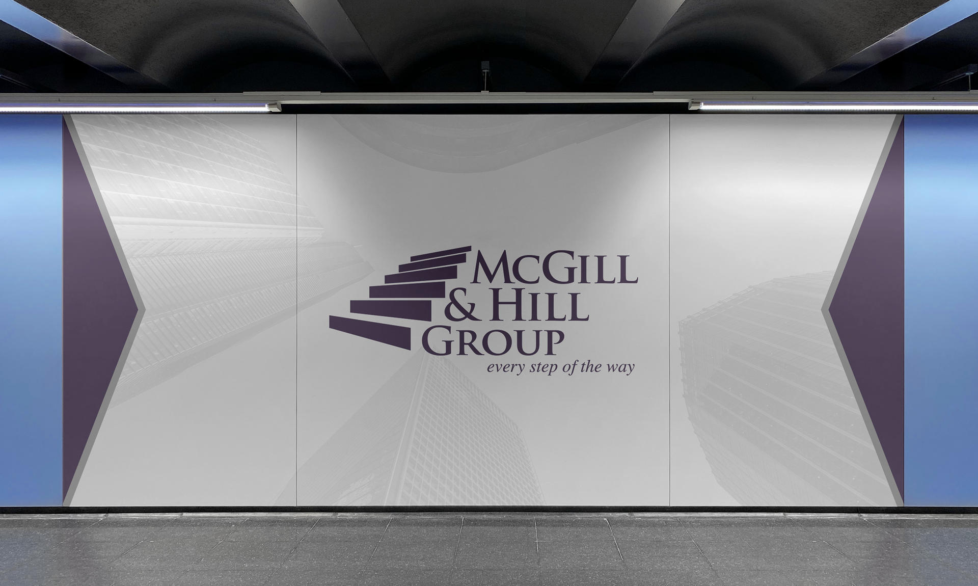
it more visually striking and aligned with McGill & Hill Group’s brand image. Specific requirements
included maintaining the color integrity of the purple banner while exploring a layout that echoed the
essence of the McGill and Lyon display for the green banner.
Challenges
Balancing eye-catching elements with professionalism Integrating the specified fonts and colors seamlessly Ensuring consistency with the McGill & Hill Group brand identity
Identity
McGill & Hill Group, a distinguished entity in the financial consulting industry, has a unique identity characterized by professionalism and expertise. Our challenge was to align the rollup banner designs with this identity while infusing a fresh and eye-catching appeal.
Approach
Research
In the initial phase of our collaboration with McGill & Hill Group, we did comprehensive research to understand their brand essence, target audience, and the specific requirements for the rollup banner design project.
Collaborative Iterations
Regular consultations with McGill & Hill Group ensured that the designs resonated with their vision. We listened to what worked and didn't work with the banners, then used that info to make them better, one step at a time. Kind of like building with Legos!
Typography Precision
The chosen fonts from the Branding Guide were implemented thoughtfully to enhance readability and convey the brand's professionalism
Creative Exploration
We started this creative journey by exploring various design concepts that would capture attention without compromising the brand's integrity.
Strategic Use of Color
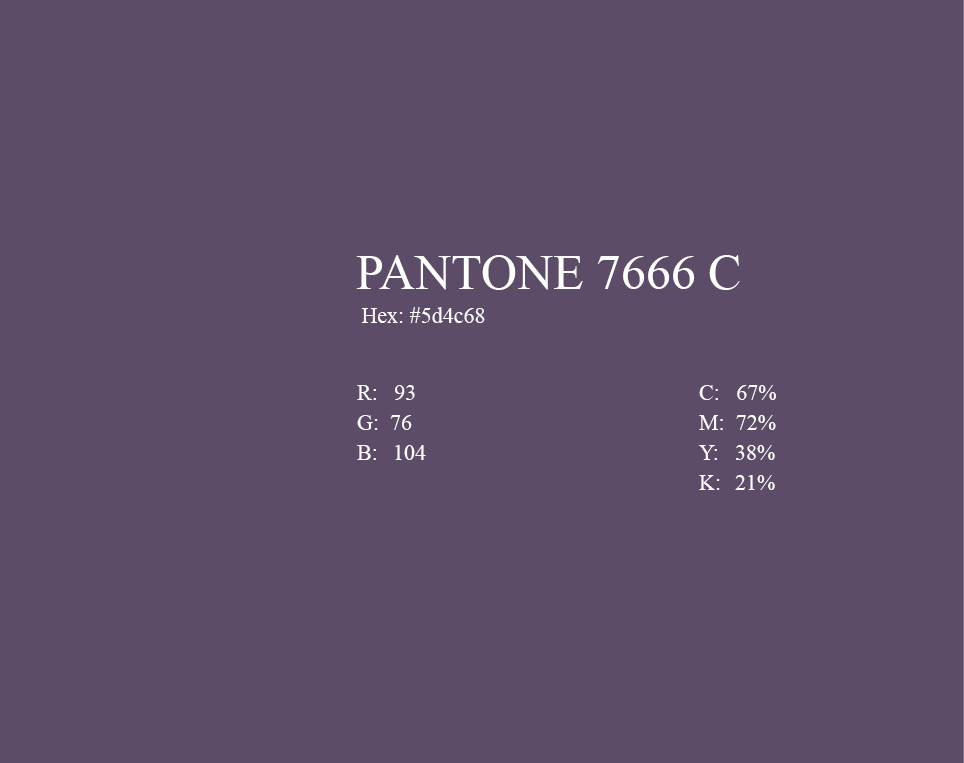
The regal purple, a hallmark of McGill & Hill Group, remained untouched in the purple banner, while its integration into the green banner was a meticulous process to maintain brand consistency.
Colour Palette


Typography
Times-Roman
Aa
Regular
A B C D E F G H I J K L M N O P Q R S T U V X Y Z
a b c d e f g h i j k l m n o p q r s t u v x y z
0 1 2 3 4 5 6 7 8 9 0 . , : ? () {} []
A B C D E F G H I J K L M N O P Q R S T U V X Y Z
a b c d e f g h i j k l m n o p q r s t u v x y z
0 1 2 3 4 5 6 7 8 9 0 . , : ? () {} []
Aa
bold
Results
The final rollup banner designs successfully achieved the objective of creating an eye-catching yet professional visual presence for McGill & Hill Group. The deep purple exuded sophistication, while the layout dynamics ensured that the banners stood out in diverse settings. Positive feedback from the client and increased engagement at events underscored the success of our collaborative efforts.


Want to outshine your competition?
Reach out to e360Digital and let us guide you towards digital goals.
Your success story starts now!
Explore More Case Studies
Property Management
Project Overview Property Development Management Professionals (PDMP) is a prominent entity in the real estate industry...
Read MoreAOM Partner
Web-Development Case Study: AOM Partner About e360Digital e360Digital, a leading full-service digital agency, recently completed a...
Read More


